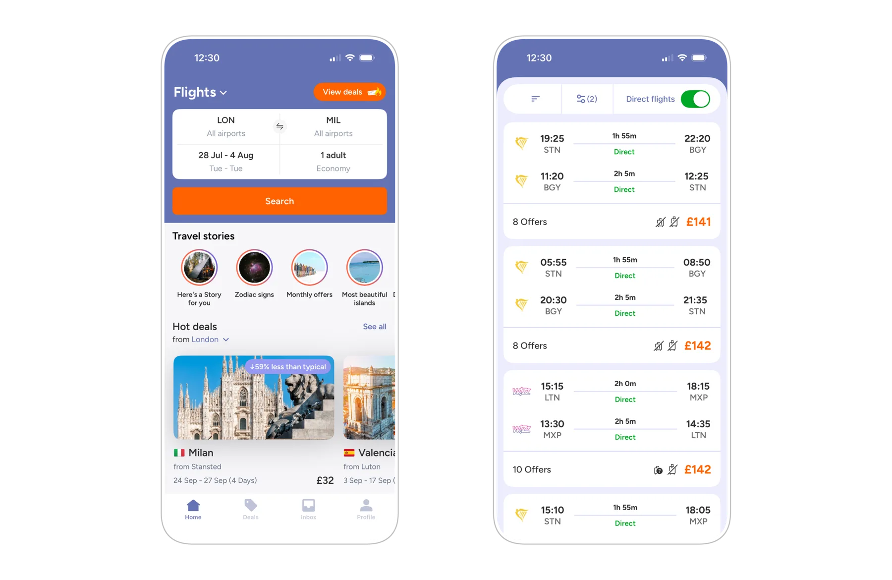
Jetcost web
Responsive flight comparison platform
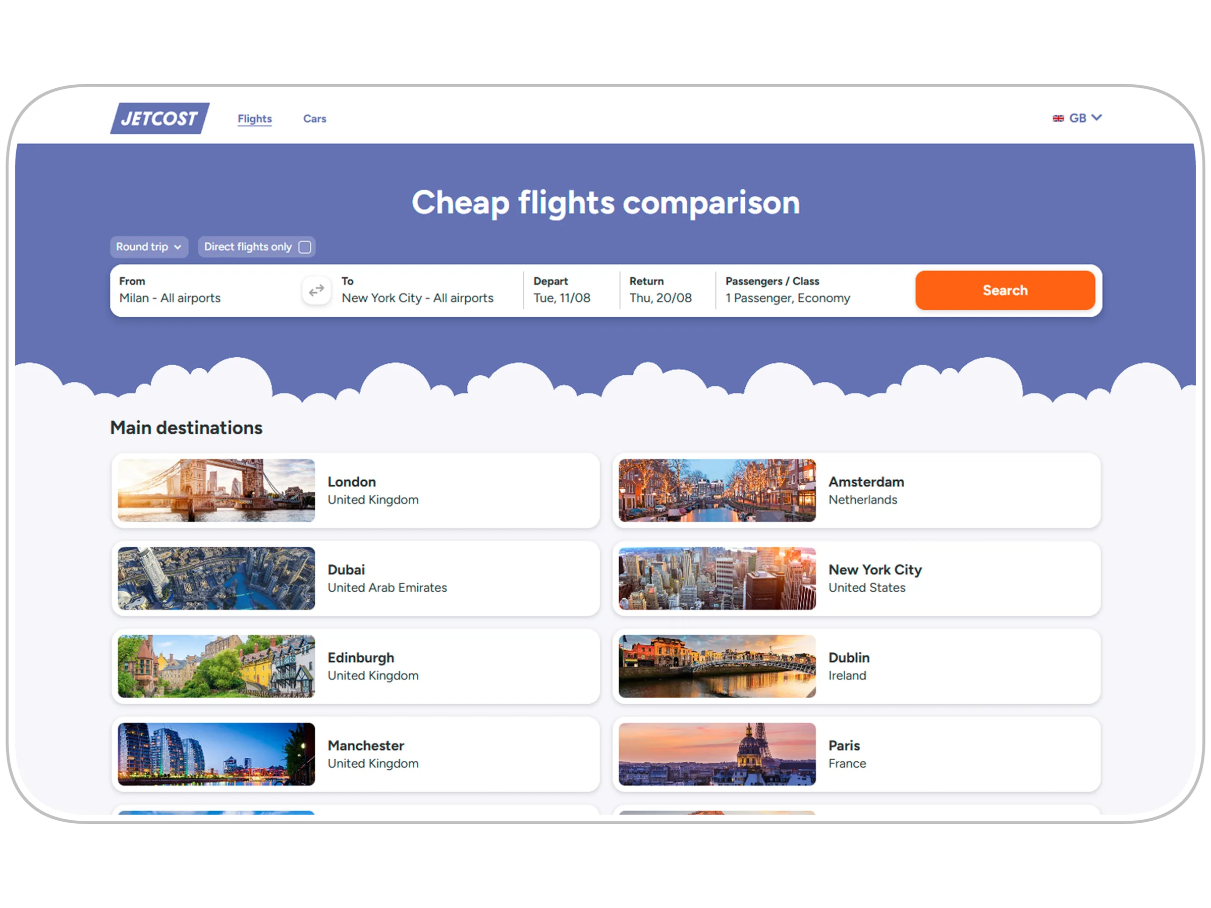
Project overview
Goal
Increase click-out and conversion. The search had to get simpler and flight comparison had to feel immediate.
Product
Jetcost is a metasearch for flights and car rental. It compares prices across airlines and OTAs in a highly competitive travel market. Traffic is mobile-first, search volumes are high.
Audience
Price-sensitive leisure travellers. They look for the lowest fare and compare several options before booking. Broad age range, concentrated between 25 and 45, digitally confident.
Visit site
Jetcost.com
- Role
- UI/UX DesignerUX Researcher
- Team
- ProductProject ManagerFrontend developersBackend developersMarketingMediaSales
- Year
- 2026

Problems and constraints
- Low awareness of the metasearch model: the purchase completes on the partner site, not on Jetcost.
- The search flow must carry everything needed to complete the purchase elsewhere, but business constraints (advertising) limit the available space.
- The site covers 40+ domains, with local translations and currencies: the layout has to hold in any viewport, mobile above all, without breaking.

Solutions and interventions
- Refreshed color palette and brand identity.
- Improved readability and accessibility.
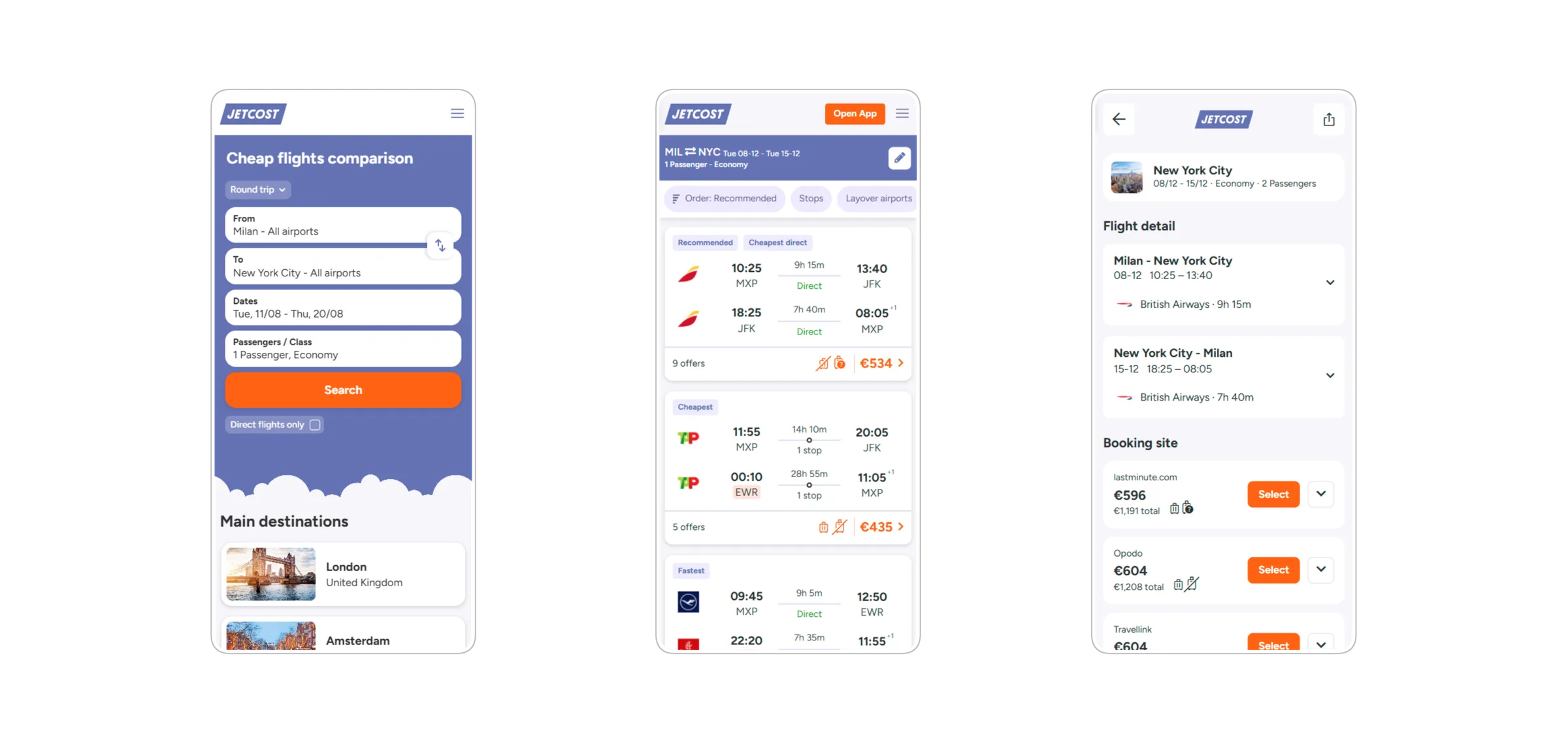
- Redesigned the core components: search form and internal suggester, itinerary card, filters.
- Introduced a detail page for some markets, with extra information such as baggage and virtual interlining.
- Improved the SEO pages.
- Ad-hoc features: nearby-dates search, promobox.
- Redesigned the click-out screen towards the partner site.

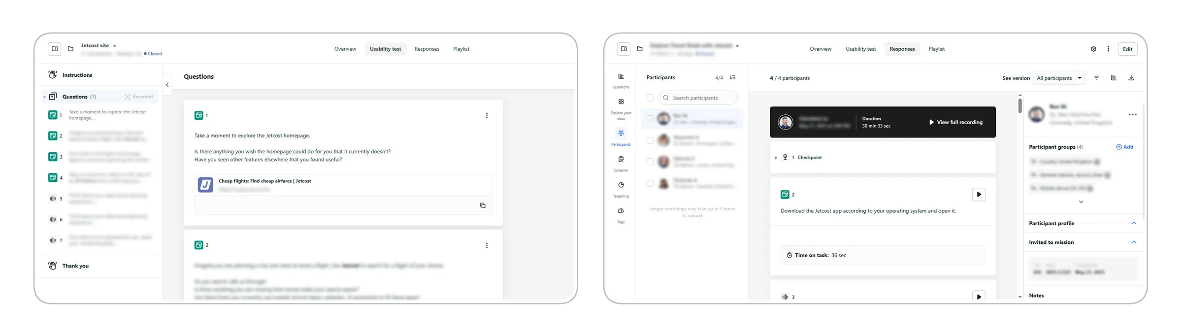
User research
I ran unmoderated usability tests and interviews with dscout to understand travel users better. I analysed session recordings and completed tasks to steer design decisions, from reviewing the existing flow to evaluating new features.
Homepage evolution
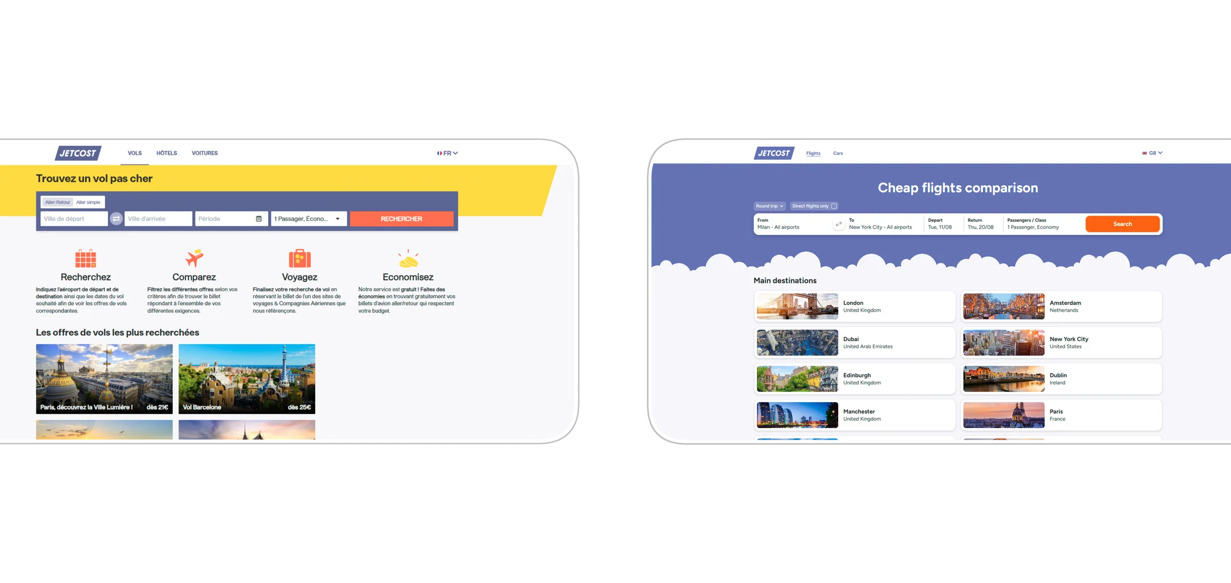
- Reduced flight search from a four-step form with explanations to a single, immediate search block.
- Replaced the yellow banner with a blue hero, enriched with a cloud illustration.
- Moved destinations from an editorial list to a grid of cards with image, city and country.
- Updated the brand identity: colors, type and spacing more consistent with the rest of the product.
Design system
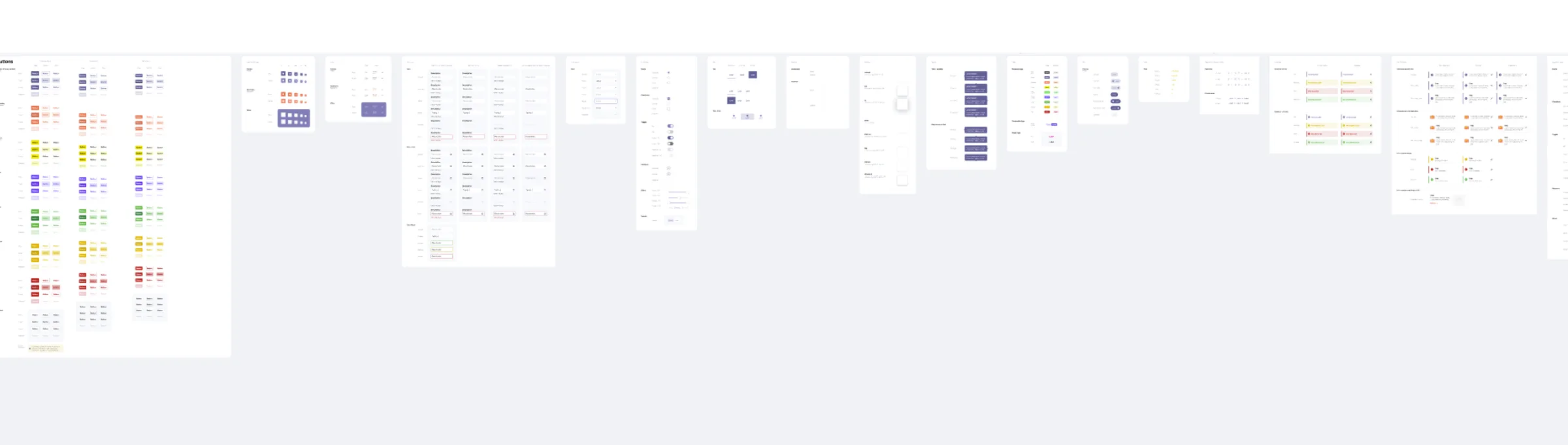
I built a shared design system for Jetcost: buttons, forms and search modules, cards, plus a color palette and type aligned to the brand guidelines. Every component is documented with its variants and states. The system holds visual consistency across 40+ domains, cuts maintenance work and speeds up shipping new features.
Email templates
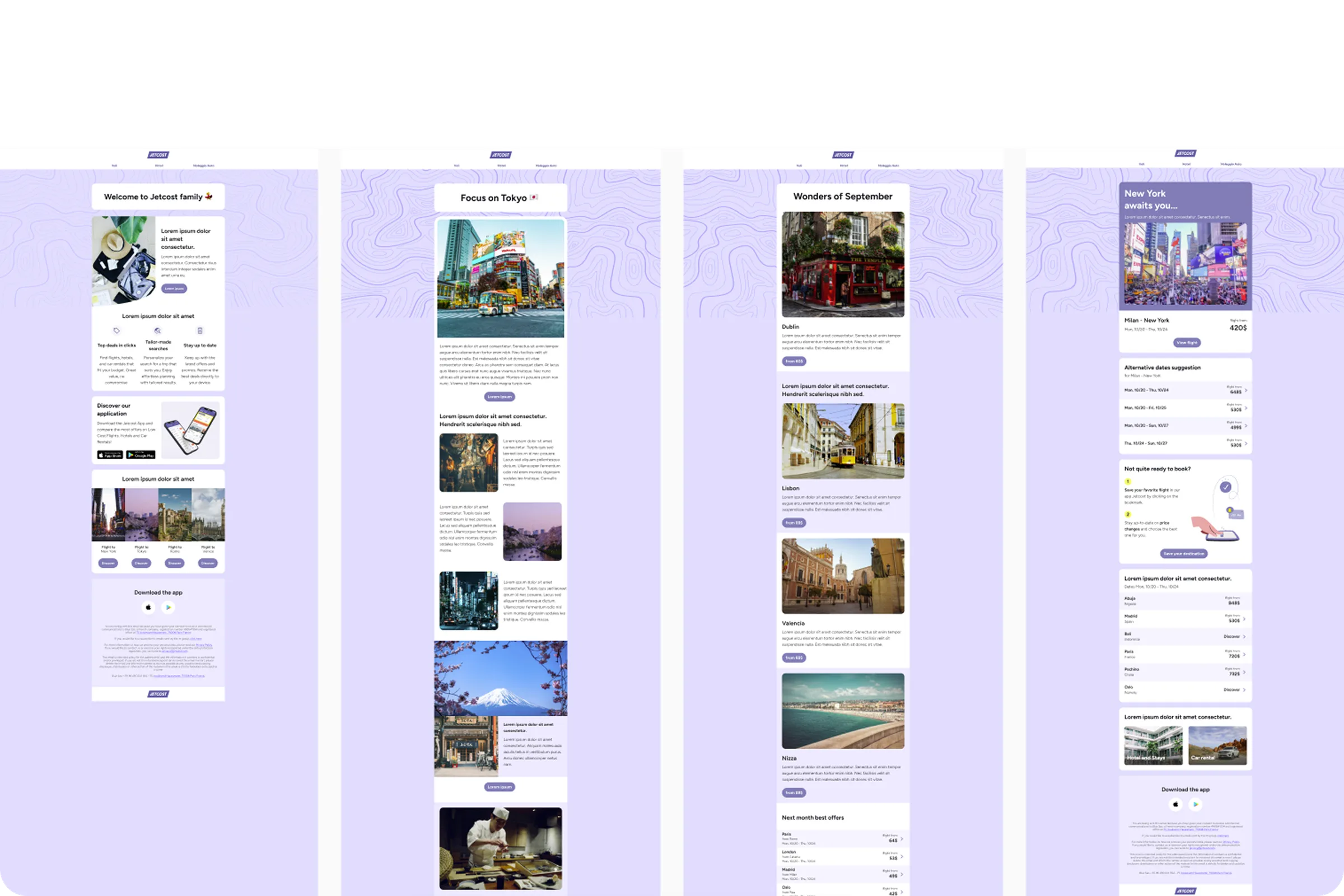
I designed modular email templates for different use cases: welcome for new users, destination inspiration, price alerts with alternative dates.
Every template shares the same base structure and adapts to the specific campaign content. Less production time per send, a consistent brand across every channel.
Results 2025/2026
+18%
Searches per session, year over year.
+16.8%
Mobile conversion.
+27%
Searches per session on mobile web.
+15%
Partner-certified bookings.
+26%
Revenue per session from the search-form redesign alone.
+25.9%
Core desktop revenue.
Next project
Jetcost app